When someone begins a review blog post with a big photo of Simon Cowell, you just know things are going to get nasty.
Actually, while Oli Gardner of Unbounce doesn’t really get nasty in his review of client landing pages he is at least brutally honest. But that is what it takes to craft a good landing page – you’re trying to craft a precise message that will leap out of the computer screen and make someone sitting there in front of it take an action. Or even harder yet, maybe they are viewing your page on a smartphone while they’re waiting in line at a grocery store – can your landing page get across a message quick enough to induce a desired action in that context?

What makes this review of landing pages really worthwhile to read is that none of the landing pages are horrible. I’d bet that each of the 22 in the set sees a reasonably good click-through rate or goal conversion rate. Most of them have what you’d consider the hallmarks of a good landing page: clean design, brief action-oriented text, a clear call-to-action, and a way to capture information. But Gardner is able to pick apart a lot of mistakes made and explains the reasoning behind why it’s not a good thing to do. For those who’ve got the basics of landing page creation down, this will help you bring your conversion optimization game to the next level.
Here’s a few points that are brought up several times in the review that are must-dos when building a landing page:
- Make the call-to-action (CTA) as clear and explanatory as possible. Saying “Get It Now!” without setting up exactly what you’re delivering when you click that button isn’t going to work out well. Make sure the page user knows what to expect when that button is clicked. Will they be emailed or called? Will they be taken to a form asking for a credit card or registration details?
- Keep the form as short as possible. Probably the best way to discourage people from converting on your landing page is to give them too much work to do. Remove that physical address field if it doesn’t really matter where they live exactly. Never ask if they want to be called Mrs. or Ms.
- It’s not “Your” free trial, it’s “My” free trial. Studies show that instead of referring to the page viewer in the second person (eg. “you” or “your”) refer to them in the first person (eg. “me” or “mine”) and you’ll see better conversion. It’s one of those simple psychological changes that makes sense when you think about it, but is easy to overlook when you’re writing content.
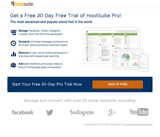
A couple of the best landing pages reviewed include those by HootSuite and ConversionLab.