Microsoft Corp. has updated its company logo for the first time since 1987.
Computer users who’ve grown familiar with the bold-face, italicized black font will see a marked difference in the new logo featuring four colourful squares next to a straight, plain font in a grey colour. The red, blue, green, and yellow squares pay homage to Microsoft’s flagship Windows brand and operating system, just ahead of the general release of Windows 8 in October.

Microsoft unveiled a new logo today.
As the Seattle Times points out, this is the fifth Microsoft logo in 37 years of company history. The previous logo was the most long-lived, and the logo used for the shortest amount of time last just for one year in 1980. In a poll on the Seattle Times Web site, the newest logo was the most popular with more than 41 per cent of visitors selecting it as their favourite. The previous logo was the next most popular choice at almost 30 per cent.
Readers on the ITBusiness.ca Facebook Page had a mixed reaction to the new logo.
“It finally actually looks like a window,” writes Matt Carson, a graphic designer at Sympatico.ca. Others described the design as clean or conservative.
“This is too close from (sic) Windows, Microsoft should have a logo that doesn’t look so similar to their product,” writes Anis Litim, art director of Toronto-based BlueBand Media. “Not to mention I don’t like this font (too simple, no personality).”

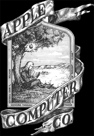
Apple’s original logo was more a more intricate design.
By comparison, Apple Inc. has had three logos since its founding in 1976. But an original, elaborate, logo depicting Sir Isaac Newton under an apple tree was quickly replaced by the iconic rainbow Apple, with a bite mark in the top right-hand corner evoking a Garden of Eden reference. That logo was replaced by the current monochrome silhouette Apple in 1998.


