


You’ve long held off, but it’s now time — even past time: You need to make your website mobile. Between what you see in the news and what your site logs reveal, it’s clear that the number of people surfing the Web from their mobile devices is growing by the day.
Here are a few tips to help your site (and you) get up to speed in this new mobile world.
Addressing the device proliferation challengeIf you start off by panicking about all the cell phones you (and your family and your friends and your coworkers) have had over the years, and then ask youself how you’re going to support all those mobile OSes and models, rest easy.
Related stories
11 mobile Web aggravations and how to deal with them
Savvy Web sites drive buyers into auto showrooms
Morphing Web sites can help you make more money
The truth is that while mobile browsing is growing by the minute, virtually all that growth is from just a few devices — mainly those running Apple’s iOS (iPhone, iPod Touch, and iPad) and Google’s Android (used by HTC, Motorola, Samsung, and others in a bunch of models).
Here’s the proof: Quantcast’s August data showed iPhone and iPod Touch together claim 56 per cent, Android devices 23 per cent, and RIM BlackBerrys 10 per cent. AdMob, which focuses on sites with ads, found similar results in its May survey: iPhones accounted for 54 per cent of usage (it doesn’t track iPod Touches or iPads), Android devices for 33 per cent, and BlackBerrys for just 7 per cent.
The good news: The popular Apple and Android devices’ browsers run on WebKit, the open source rendering engine, as do the less-popular WebOS-based Palm Pre and Pixi and the new RIM BlackBerry Torch.
The bad news: These devices come in all sorts of screen dimensions, as the table below shows.
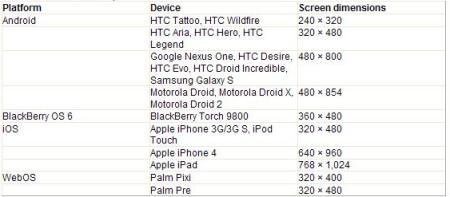
The really bad news: Although all of these browsers run on WebKit, all of them run WebKit just a little differently. Peter-Paul Koch of QuirksMode ran 19 WebKit-based browsers through 27 tests and described the results as “thinly veiled chaos.”
So let’s try to bring some order to that chaos, first by being a little picky, and then by using a touch of HTML, CSS, and JavaScript to handle the remaining issues.
Yes, there are a lot of devices, but you don’t have to support them all. Do so by eliminating the outliers:
- Sorry, RIM. Sorry, Microsoft. You had your day in the mobile market (well, RIM did; Microsoft never did quite figure out a solution to Windows + mobile device + usable), but it’s over. There may still be plenty of these devices, but research has shown that they aren’t used to surf [PDF].
- Sorry, small screens. Unfortunately, a 240-by-320 surface is just too small for a good browsing experience. The Pixi’s 320-by-400 screen is almost twice as large, yet barely made the cut.
Related story –Video Blog: Windows Phone 7 vs Google Android vs Apple iOS
- Sorry, third parties. Every device you should care about ships with its own Web browser. If you have an Android, you have a choice of browsers, including Opera Mini and Mobile Firefox. But you have to draw the line somewhere, and unless you have a fully funded lab, it’s unlikely you’ll be able to test your site on every permutation of browser and screen size. So stick with the browser that the device maker included.
- Anything else you’re thinking about dropping? This is where your server logs come in handy. Keep in mind, though, that while you may have few mobile visitors now, it might be solely because they don’t (yet!) find your site welcoming.
The nitty-gritty of making your site overLet’s say you have a fairly normal website: It has content, a menu bar, a header, and footer (see Figure 1). You know it’s built to standards, so you assume it’s going to work just fine without any changes. And then you look at it on an iPhone 3G S (see Figure 2) or a Nexus One (see Figure 3). And you remember you thought that navigation bar was so snazzy when you got it working, but now realize mobile devices don’t support hover effects. And you start trying to figure out which would be easier: redesigning the entire site or creating a duplicate mobile version?

Figure 1: The website, as it appears in a desktop browser.

Figure 2: While the iPhone 3G tried, it still couldn’t pretend it was a real browser.

Figure 3: On Android, it was plain teeny-tiny
Thankfully, those aren’t the only two options. I’ll take this site (you can see the live version on your mobile or desktop browser) and show you how to add a little more markup, style, and code. Then we’ll be done — no redesign or duplication needed.
The viewport. You start off with the viewport –a concept invented by the W3C, but one that garnered little attention until the iPhone came along. In the chart on the first page in this article, you’ll notice that before the iPad and iPhone 4, Apple’s devices were all 320 pixels wide. However, on those devices, Mobile Safari thought that it had a width of 960 pixels. That meant that internally, your site was compressed to a third the width, and then put out on the screen. Want to change that equation? That’s the viewport.
That line goes into the head section of your HTML and tells mobile browsers that you may think your width is 960, but I think you should be satisfied with 320 pixels across — or whatever the device-width happens to be.At least that’s the way Apple described how it should work; in practice, I’ve had better luck giving the viewport a fixed width:
This is one of those gray areas where there’s no one right answer that fits all sites on all devices; you need to play with it to find what width works best for your site.
Media queries. Next up is a little bit of custom CSS geared toward the mobile crowd.
The first part of the link tag looks like a straightforward style sheet, up until the end. The media attribute is how you can identify not just mobile browsers in general, but which mobile browsers in particular. The only screen keywords are the voodoo that tells mobile browsers that this is just for them. After that, you can get picky about which browsers, but here you’re looking for all mobile devices that have a maximum device width of 1,024 pixels — that is, everything up to and including an iPad. Because of this line, every mobile device will load mobile.css.
Now, you can get a little more particular:
This starts off similar to the earlier broad media query, but then looks at the minimum pixel ratio of the device. If it isn’t 2 or higher, you aren’t interested. Right now, the only browser fitting that description is the iPhone 4 with its Retina display. This line lets you tweak details a little for Apple’s latest toy, which gets to use mobile2.css.
For the next line, it helps to remember that these devices can be in horizontal or vertical orientation when your page loads. You can’t just say you want all devices that are at least 480 pixels across; if the device is in landscape orientation, you may get a false positive.
This line brings in the same style sheet, but for different device: one with both a minimum height and minimum width of at least 768 pixels. That’s the iPad, and it’s going to get the same special style sheet as the iPhone 4.
Style your site. To understand what’s going on in mobile.css, you first have to know a little about how the site is put together. See those big gray bars on the right and left of the page in Figure 1? The middle section, #container, is only 80 per cent of the page. And while it looks nice on a big display to have all that room on the sides, it’s a waste of space on a mobile device. So start off by making the content fill the entire width:#container { width: 100 per cent; }
Something you may have noticed while looking at Figure 2 or Figure 3 (or looking at sites with one of your own devices): Bold fonts aren’t attractive. They take up too much room and don’t display well. Let’s stop that for the site’s normally bold navigation:
#navbar { font-weight: normal; }
Next up, it’s time to tweak your fonts. Each device comes with certain fonts, and I wasn’t able to find any one font on all devices (but then, you can’t even necessarily find out what Web fonts ship with a given device — I’m looking at you, Android). But here’s what’s worked for me:
h1, h2, h3, h4, h5, h6 { font-family: Albany, Georgia, “Times New Roman”, “Droid Serif”, serif;}
Albany is a serif font found on the Palm devices, Droid Serif on all Android devices, and Georgia and Times New Roman are on the iPhone and iPad. If you’re supporting BlackBerry as well, add “BB Alpha Serif”.If you prefer sans serif fonts, try:
h1, h2, h3, h4, h5, h6 { font-family: Prelude, Verdana, Arial, “Droid Sans”, sans-serif;}
Prelude is a sans serif font found on the Palm devices, Droid Sans on all Android devices, and Verdana and Arial are on the iPhone and iPad. If you’re supporting BlackBerry as well, add “BB Alpha Sans”.
If you’ve used one of the higher-end mobile browsers and swapped orientation, you may have found it, well, a little disorienting. You’re looking at a page where the fonts are a certain size, but then you go from portrait to landscape and the font size suddenly makes you feel like you’re in a funhouse. So let’s add a little styling to handle that:
.landscape { font-size: .5em; }
.portrait { font-size: .8em; }
I’ll show you the JavaScript later that provides the functionality behind this, but suffice it to say for now that when the page has its class attribute set to landscape, your fonts are at half-size; when it’s in portrait orientation, the fonts are at 80 per cent.
The lucky iPhone 4 and iPad have some special styles of their own:
.portrait #header img { width: 50em; }
.landscape #header img { width: 75em; }
Looking back at Figure 1, you see that the header graphic is larger than will fit properly in most mobile browsers. The others will cut it off, and that’s fine. But some browsers can handle oversized images, so tell them to compress it a tad instead.
The end result is shown in Figures 4 through 8. No, they aren’t identical; with screen sizes that vary as much as these devices do, they shouldn’t be. But they’re all clear and readable, and that’s what matters when you’re on the move.

Figure 4: The iPhone 4 in landscape mode, post-modifications.

Figure 5: The iPad version never looked too bad, but the modified version definitely makes it easier on the eyes.

Figure 6: This looks much better than Figure 3 (and not only because it’s now horizontal).

Figure 7: The Palm Pre Plus finally gets its chance to look good.

Figure 8: The iPhone 3G S gets to show off how the hover menus work when tapped.
With some simple Web technologies, it’s not difficult to make your site feel friendly to even the smallest among us. Hopefully, you’ve seen that you can get a start without a whole lot of effort.
After you’ve become comfortable with these techniques, you can take the next step and work with the user agent detection method I described for Android. From there, you can detect other devices and load specific style sheets for each to invoke more layout-oriented CSS functions. For example, you may end up showing and hiding divs, placing divs in different locations, or actually changing the layout of a Web page based on the mobile device accessing it — but that’s for another day.
Source: InfoWorld
