


Whenever I’m asked to review an e-reading app, my first reaction hovers around snarky amusement. “Come on,” I say to myself. “If it shows text and you can read books, it’s a fine e-reader.”
That I conduct this inner monologue each time I’m charged with such a review is clearly a personal failing—especially because I’m wrong. The ideal e-reading app should become as invisible as a paper book can, but not shy away from offering the advantages that only digital books can.
Last week, Apple unveiled iBooks 2. If you generally use the app on an iPod touch or an iPhone, iBooks 2 offers virtually no improvements over its predecessor. The bulk of the improvements Apple made to the app are limited to the iPad.
The big news with iBooks 2 was Apple’s introduction of iBooks interactive textbooks, along with the new Mac app iBooks Author to create those media-rich, interactive ebooks. The new textbook format—or any book created with iBooks Author—works exclusively on the iPad.
Thus, iBooks on the iPad now feels a bit like two apps smushed together. There’s the iBooks of old, for reading basic books with text and images, and then there’s iBooks 2 for reading and interacting with these new, multimedia-laden iBooks Author books. For the purposes of this review, let’s refer to the original kind as regular ebooks, and the new ones as optimized ebooks.
To test out the optimized ebooks, I downloaded several from the iBookstore built into the iBooks app. The first thing you’ll note about optimized ebooks is that their file sizes are much, much larger than traditional ebooks. Tolstoy’s 1300 page War and Peace (a regular ebook) downloaded to iBooks in about five seconds on my iPad; it’s 2.3MB. E.O. Wilson’s Life on Earth, an optimized textbook of which just 51 pages are available, weighs in at 965.3MB. It took a lot longer to download.
If you do the math, that puts War and Peace at about 1.8 kilobytes per page, to Life On Earth’s 19 megabytes per page. It’s not surprising that textbooks crammed with 3D models, movies, and other interactive elements would be huge, but it’s something to keep in mind, particularly if you use a 16GB iPad or a slower Internet connection.

The good news about optimized textbooks like Life On Earth is that they really are beautiful. The experience of reading the books is cruft-free; the original iBooks theme that wasted screen real estate showing a skeumorphic bookbinding as you read is nowhere to be found in fancy reading mode. Gone too are the overwrought page turning animations, as pages simply slide into view as you swipe—it’s very similar to the Kindle app’s page-turning experience. (A previous update to the iBooks app offered an option to disable the virtual book look when reading a regular ebook; look for Full Screen under Theme in the Font menu.)
Though obviously this depends on how the author prepares your fancy textbook, all the launch textbooks currently available offer impeccable, incredible design. Tapping to play a movie, or using your fingers to explore a 3D model or interactive graph, is very cool.
Unfortunately, though, because of how carefully laid-out these optimized ebooks must be, the ebooks themselves aren’t as flexible as regular ebooks. You can’t, for example, adjust the font or font-size when you’re reading an optimized book, since that would mess up the formatting. (It would also mean that if an instructor asked you to turn to page 27, your page 27 might be different from your classmate’s—no good for the intended classroom audience.)
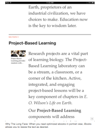
The sole exception to this font manipulation limitation occurs when you rotate your iPad from landscape to portrait. When you do that, you bid farewell to the fancy book’s fanciful layout, and instead get a view more akin to one that Instapaper or Safari Reader might provide. All the interactive elements get pulled out to the left margin, with the text flowing across the rest of the screen. Instead of turning pages, you simply keep swiping vertically—again, just like in Instapaper.
In this view, you can freely adjust the font and font size. In most of the textbooks I sampled, the font size used in the fancier landscape view was readable, but smaller than my old man eyes might prefer for lengthy reading; that I can adjust the font size in portrait mode is a welcome nicety. And since the portrait view doesn’t use a page-turning mechanism, it can keep page numbers consistent. Page 17 might be two feet long if you measured it out, but all the text that should be associated with that page number is.
When you’re reading optimized ebooks, you get access to iBooks’s new highlighting features. All you need to do is tap and drag over text to highlight it. Tap the highlighted text to change its highlight color (or switch to underlining), or to add a note. When you’re reading a regular book, this same gesture merely selects the text, at which point you can choose whether to highlight it or not.
To select text in optimized books, you can either double-tap, or tap and hold without moving your finger while holding until the selection interface appears. Only by selecting text—as opposed to highlighting it—can you bring up the option to see a word’s inline definition.
When you add a note to highlighted text, a tiny note icon is added to the page’s margin. Delicate-fingered folk should have no problem tapping the tiny icon, but fatter-fingered folk like me might accidentally turn the ebook’s page (in landscape view) if they inadvertently tap elsewhere in the margin. Switching to portrait view eliminates that problem, since you don’t tap to turn pages in that mode, on the optimized ebook side. If you’re attempting to review notes in a landscape mode or while reading a regular book and you find the tiny tap target too small to hit with any accuracy, you can instead tap once on the highlighted text the note is linked to, and then on the easier-to-reach Notes icon that appears.
iBooks already offered a screen that consolidates all of your notes and highlights for a given book. While that screen now looks slightly different depending upon whether you’re reading a regular or optimized book, it remains tremendously helpful either way. New in iBooks 2—but limited to optimized books—is a Notecard view.
The new view groups your highlights and notes into virtual notecards, with your highlights on one side and your notes on the other. You can shuffle the notecards to test yourself, and even limit the cards to highlights of a specific color. And you can optionally include glossary terms from the book in the notecards—words on one side, definitions on the other. It’s a shame you can’t use notecards to study notes taken in regular books, and I can’t imagine the limitation is a technical one; it’s simply a feature Apple has only chosen to make available for optimized ebooks.
Notecards do suffer from one frustrating oversight: You can’t jump from a notecard directly to the highlighted text in context within the ebook. You can do so from the more traditional notes view, and it’s a great way to dive in when you’re reviewing your notes. Apple at least includes the page number as a reference on the notecards, and since iBooks 2 introduces the ability to use the search field to jump to a specific page, all is not lost. But a direct link from card to associated book page would eliminate a couple steps.
In an optimized ebook, a two- or three-finger pinch takes you from your current page back to the Chapter overview screen. That screen provides links to subsections within the chapter, along with thumbnail-based page navigation. (You can pinch with more fingers if you disable multitasking gestures in the Settings app.) In a regular book, you instead tap to bring up the menu, and then tap the navigation icon, and then tap for the Table of Contents.
Besides their far smaller file size, regular books in iBooks offer a significant advantage compared to their fancy book brethren, perhaps the best reading-centric feature iBooks offers—a small text indicator stating how many pages remain in the current chapter. One key advantage paper books hold over ebooks is the ease with which you can flip ahead to find a good stopping point; the “pages left in this chapter” indicator offers an excellent digital alternative—and it’s nowhere to be found when reading optimized ebooks.
Additionally, iBooks has never once crashed on me while I was using regular books, since I first started using the app. In less than a week of reading the occasional textbook, I encountered two crashes that left me staring at nothing but Apple’s stock linen background. I needed to force-quit the iBooks app and relaunch it to get back to reading. I have yet to reboot a paper book.
Those optimized books are so big that it sometimes takes even the iPad 2 some time to process them. When I tap Library to return to my bookshelf from a fancy textbook, iBooks takes a long moment to gather its thoughts before it takes me where I want to go. Returning to the library from War and Peace, on the other hand, is essentially instantaneous.
Beyond the handful of crashes, the missing “pages remaining” text, and the huge file sizes, the other knock against optimized books is their complete failure to work on the iPhone—it can’t be done. I’m not saying it would be easy, but Apple should be able to offer some means—likely inspired by the portrait view experience on the iPad—of fitting these books on the iPhone’s smaller screen. It’s a huge ebook advantage to be able to read another couple of pages while you’re waiting in line or somewhere else without your iPad. Sure, interactive elements might not be quite as easy to experience on the iPhone, but “not quite as easy” is far better than “not available at all.”
I said at the outset that my preference in e-reading apps is that they just get out of the way and let you read, while still packing in the advantages that their digital nature can afford. With regular books, iBooks succeeds.
With optimized books, the app succeeds too—but in a different way. It’s not at all complicated to read an optimized textbook in the app, and anyone familiar with an iOS device should mostly be able to navigate such a book without trouble. (The one gotcha is remembering the pinch gesture to get back to the Chapter view.) But you do need to examine each element on the page to know what it can do: Is this just a photo, or is it a slideshow, or a model, or an animation, or a video, or something else? Again, it’s not hard to answer such questions—you just look at the interactive element’s description to see what it does. It’s a different way of reading, and it makes the books feel much more like exquisite webpages than texts. That’s not necessarily either good or bad—but it’s undeniably different from traditional reading. Where iBooks does a superb job getting out of your way as you read regular books, it screams “THIS IS AN IMMERSIVE MULTIMEDIA EXPERIENCE” when you read fancy ones.
If iBooks were two apps, I’d give the one for reading regular books a higher rating, and the optimized experience a still favourable-though-slightly qualified recommendation. And I’d feel conflicted about it, because when it works on the iPad, the optimized reading experience really is impressive.
But the limitations—the occasional crashes, massive file sizes, missing “pages remaining” feature, and lack of iPhone support—mar an otherwise great experience.
[Lex Friedman is a staff writer for Macworld.]
