


After spending several days with the Developer Preview of Windows 8 on a PC, it’s clear that Microsoft’s new operating system — which offers two separate interfaces, Metro and Desktop — is a transitional one between traditional computers and mobile devices. All of Microsoft’s energy and creativity has been devoted to the new Metro interface; there’s very little new of note for the old-fashioned Desktop.
As I tested Windows 8, I found myself wanting to use it on a tablet instead of my PC, because the big-tiled Metro was so much more visually appealing than the traditional Desktop, with a more intriguing feature set. After using Windows 8 for some time, it’s clear that Metro is the future of Windows, and the Desktop the past.
Related Stories
– Analysts question if Windows 8 will be limited on low-power processors
– Intel’s Ultrabooks aim to be Windows 8 flagship device
…

An interesting note: You usually expect developer previews and betas to suffer from performance woes because code hasn’t yet been optimized, and bugs may slow things down. However, the Windows 8 Developer Preview is surprisingly fast, even on my aging test machine. I installed it on a dual-boot Dell Inspiron E1505 with 1GB of RAM and a single-core Intel T2400 1.83GHz CPU, which is near the very bottom of the hardware requirements for Windows 8. Yet I found it to be extremely fast and responsive. In fact, it feels zippier than Windows 7 running on the same machine.
Clearly, Microsoft has done a great deal of work on optimizing Windows 8. There’s good reason for that; if it’s going to work on a tablet, it needs to be fine-tuned.
Getting used to Metro
When I first started using Windows 8, I was surprised to see that the Desktop was no longer the command central for the operating system. You boot into Metro; Desktop has been relegated to just another app accessible from the Metro screen.
Metro has been clearly designed for tablets. Like Windows Phone 7, Metro’s main interface is made up of large colourful tiles, each of which represents a different app and each of which can exhibit changing information, such as the latest news, social networking updates, weather and stocks.
In addition, Metro has a horizontal design, with tiles stretching off the right edge of the screen. On a tablet, you’ll swipe to uncover new tiles; on a PC, you’re relegated to dragging the bar at the bottom of the screen or clicking navigational arrows. Even after several days of use, I never got used to dragging or clicking to reveal the extra tiles; I longed for a touch screen so I could swipe instead.
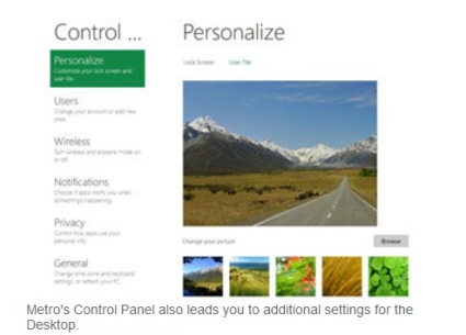
Metro is customizable. You can drag tiles to new locations or customize select parts of the interface via its own Control Panel. You can change the picture on your Lock Screen and your user tile; change user account information; turn wireless on and off; turn on airplane mode and change settings for privacy, search and Windows Update. You can also change your home network settings via HomeGroup (introduced in Windows 7) and your sync settings.
In my initial test of Windows 8, I didn’t use Metro that much. But over time I found myself migrating more to Metro when I was actively looking for information.
The constantly changing information stream, including news stories, RSS feeds and updates from friends and acquaintances on social networking sites, is quite useful and almost hypnotizing. In Metro, instead of having to seek out information, information comes to you.
Metro apps
Metro apps run full screen like their tablet and Windows Phone 7 counterparts. On a desktop, they take getting used to, because there’s no Windows menu — although after a few days, I became more comfortable using them. You can’t change their size or shrink them, though. Switching between them on a PC is kludgy and requires the old Windows standby, Alt-Tab. I eventually discovered another way to do it: Hold the mouse pointer at the far left of the screen until a small icon for the previous app appears and then click to switch to it. All in all, though, Alt-Tab is easier.
Unlike earlier versions of Windows, which had few consumer-level apps built in, Windows 8 offers a plethora. The Metro screen is filled with Microsoft-written games, social networking tools and other apps. They’re designed for a tablet or smartphone, although they’re usable on a PC as well.
The basic News, Weather and Stock apps are straightforward and simple to use. The News app, for example, offers a list of dozens of RSS news feeds organized by topic, including Business, Design, Entertainment, Lifestyle, Music, Technology and News. Click the ones you want, and they’re added to your feed. You can also directly type in the URL of a feed you want to add.

Once you set your apps to grab the data, you’ll be able to see constantly changing information in the tiles themselves — mostly, summaries or headlines — without having to open the apps. If you see something that interests you, click the tile to be sent straight to that app — but not necessarily to the specific information you’re seeking. For example, when I clicked a headline about the current Republican nomination race on a news tile, I was sent to a page with all the news headlines and had to look for the story. On one occasion, the headline that appeared in the tile wasn’t even immediately visible; I had to scroll to find it.
I tried a few other apps as well. The Tweet@rama app is a simple, straightforward front-end to Twitter, and lets you create and read tweets. It’s not nearly as useful as a full-fledged Twitter client such as TweetDeck, but for the basics, it’s fine. The Socialite app performs similar functions for Facebook. Other apps include a location-based app called NearMe, an app for setting alarms and a paint app called PaintPlay.
One problem with these apps, though, is that there is no standard way to interact with them on a PC. For example, in the News app, right-clicking brings up a context-sensitive menu — if you’re reading a news article you’ll get navigation buttons, and if you’re on a summary page, you’ll get options for adding, refreshing and removing feeds. But if you’re in the Zero Gravity game app, right-clicking does nothing. More standardization would be welcome.
Worse yet, there’s no clear way to close down many of these apps. For example, Zero Gravity, which features intensely annoying music, doesn’t have a menu or any way to shut it down — so when you switch out of the game to the main Metro interface, the annoying music still plays in the background. Switch to the Desktop or run another Metro app, though, and the music thankfully goes away. In fact, I found that my workaround for closing most Metro apps was switch to the Desktop; after a few minutes, the Metro app I was running typically shut down.
The familiar Windows Desktop
All that being said, when it came to doing actual work such as using MIcrosoft Office, I ended up on the Desktop for the simple reason that that’s where the serious applications were.
After you click the Desktop tile on the Metro screen, you’ll feel at first as if you never left Windows 7 behind — the interface looks and works almost identically to Windows 7. You’ll see the familiar taskbar across the bottom with taskbar thumbnails, the Notification Panel on the right, the icons on the screen and so on.
There are some changes, though. Most noticeable is that the Start button has been thoroughly revamped. Clicking it sends you back to the main Windows Metro screen rather than popping up the familiar Start menu with a search box, folder navigation, a link to the Control Panel and so on. In the Metro interface, however, the Start button functions as a task switcher between the interface and any running apps.
If you want to find your various Windows options, you need to move your mouse pointer to the leftmost bottom corner of the Desktop; a menu pops up that gives you access to Settings, Devices, Share and Search. When you click one of these options, a panel slides into place on the right side of the screen to let you perform the task you’ve asked it to do. Select Search, for example, and the panel shows a search box, along with a variety of locations where you can search.
The Share button lets you share a screenshot using the Socialite social networking app. The Devices button, designed for printing, playing games and sending content to others, doesn’t work in this version of Windows 8. And the Settings button lets you change only the most basic functions of the Desktop.
One would expect to find the old Windows standby, the Control Panel, when you click Settings, but no — instead, you’ll have to head back to Metro and click the Control Panel tile, scroll to the bottom of the Metro Control Panel and click “More settings,” which takes you to the old Control Panel. If the awkward, time-consuming navigation to get to the Control Panel isn’t an indication of how little importance Microsoft attaches to the Desktop, I don’t know what is.
There are a few other tweaks. For example, Windows Explorer now has a ribbon interface, a great improvement over its previous version.
Bridging different interfaces
Even after using Windows 8 for some time, I never got used to the dramatic differences between the Metro and Desktop interfaces. It never quite seemed as if it was a single operating system — instead, it felt like two different OSes bolted together.
Making matters worse is that Metro apps don’t show up on the Windows desktop. And although desktop apps appear in Metro, they’re so well-hidden you may never realize they’re there: With the exception of Internet Explorer, they’re stuck all the way on the far right of the tiles so you have to scroll to get to them. And even when you run Desktop apps from Metro, they can’t take advantage of Metro’s ability to exhibit information via tiles. One hopes that will change in future versions of Windows 8.
Microsoft has made some small attempts to bridge the gaps between the interfaces. Metro and the Desktop share some basic navigation — for example, in both of them, when you move your mouse to the bottom left of the screen by the Start button, you get the previously described options menu, along with the date and time, and notifications such as whether you’re connected to a network and the power state of your computer.
This is a good way to try and create commonalities between two very different interfaces, but it doesn’t always succeed. In the Metro interface, the options are context sensitive, so when you’re in an app and click Settings, for example, the settings will relate to that app. However, if you click Settings on the Desktop the results always pertain to the Desktop, whether or not you’re currently using an app.
Windows 8 and the cloud
Windows 8 is clearly being designed with the cloud in mind as well. After installation, you’re asked to enter a Windows Live ID, or to sign up for one if you don’t already have one. Your Windows 8 machine is then linked to Microsoft’s cloud-based Live services, including Windows Live SkyDrive, which is expected to become the central location for your files.
On this Developer Preview running on a PC, however, only a few cloud services were available, something that will likely change in the future. In the Metro interface, when I clicked Control Panel, I found Sync PC Settings, which are designed for a cloud-based world in which people use multiple devices, including Windows-based PCs, tablets and smartphones.
By default, Sync is turned on, which means that your global settings — such as app settings, screen lock picture and themes, browser settings, taskbar and Windows Explorer settings, and some passwords — are automatically synced among all your devices. You can decide whether to sync devices that use a metered data plan.
Surprisingly, nowhere could I find settings for automatically syncing actual data and files via Microsoft’s cloud storage service Windows Live SkyDrive. Possibly that will appear in a future Windows 8 version.
Two ways to use Internet Explorer
Windows 8 Developer Preview comes with not one, but two versions of Internet Explorer 10, one for the Metro interface and the other for Desktop. The underlying engine, which supports CSS3, HTML5 and Flash, is the same for both, but the surrounding interface is dramatically different.
In the Metro version, you browse full screen, with no controls immediately visible for typing in a URL, adding bookmarks, refreshing a Web page or switching between tabs. Right-click anywhere on the page, though, and those controls appear at the top and bottom of the screen. The top of the screen shows clickable thumbnails of all open tabs. You click on the X to close the tab and click the + to open a new tab, at which point a screen appears that shows pages that you frequently visit, as well as sites that you’ve pinned so that they’re always visible whenever you open a new tab. These pinned sites also appear on the main Metro interface.
The Address Bar appears at the bottom of the screen when you right-click; it lets see your current URL and typing in a different one, go forward or back, refresh the current page, pin the current page, findtext on the current page and switch to the Desktop version of IE.
The Desktop version of IE 10 looks and works much like Internet Explorer 9, with the usual menu-less, tabbed interface.
Because the underlying engine is the same, if you switch from Metro to the Desktop version, the Desktop version will have all of the currently open tabs, current URL, and so on.
The bottom line
Windows 8 on a desktop feels very much like a transitional operating system, attempting to bridge traditional PC-based computing and mobile computing done on tablets and smartphones. Even after several days of use, the experience was slightly awkward, and I never got over the feeling that I was using two separate operating systems — Metro and the Desktop — joined together by a slender thread.
I expect that tablet and smartphone users will rarely make their way to the Desktop, especially with the recent announcement that Microsoft will be developing a Metro version of Office.
In fact, based on this early Developer Preview, there may not be much for enterprises in Windows 8. Upgrading from Windows 7 or Vista to Windows 8 would likely be a problem for businesses because the Metro interface is so different from earlier Windows versions.
Given the amount of resources that Microsoft has spent on Metro, and the few it appears to have expended on the Desktop, I wouldn’t be surprised if the Desktop will eventually fade away in future Windows versions. The main screen you boot into in Windows 8, Metro, calls out for a touch interface — and Microsoft is clearly betting that touch-screen PCs will eventually become standard.
If that happens, and when there are Metro versions of applications such as Office, the Desktop will become even less important than it is now in Windows 8. Windows 7 may well be the last time that Windows’ longtime primary interface, the Desktop, has centre stage.
Preston Gralla is a contributing editor for Computerworld.com and the author of more than 35 books, including How the Internet Works (Que, 2006).
