


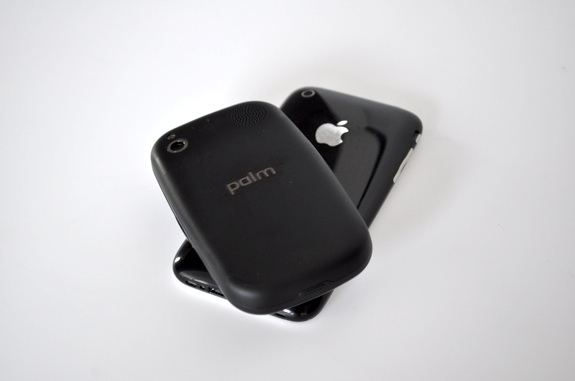
iPhone 3G and Palm Pre Compared
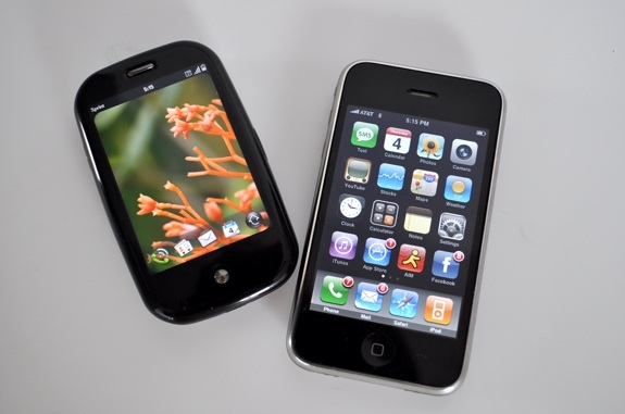
The iPhone 3G (right) and the Palm Pre both have a multitouch screen; both have similar feature sets and are used in a similar manner. But they are distinctly different. If you’re already accustomed to the iPhone but considering moving to the Pre, you can expect to relearn some actions. Let’s have a look at some of the subtle differences in usability and layout of the two phones.
Note: Apple is expected to preview a new iPhone OS 3.0 at next week’s Worldwide Developers Conference. This story compares iPhone OS 2.2.1 with Palm’s webOS.
Waking the Phone
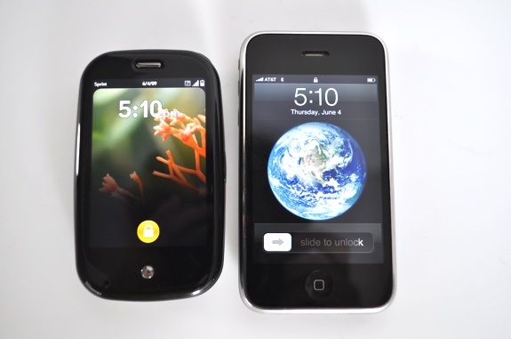
Both phones have a sleep-wake button at the top, with a “home” button on the front (which, on the Pre, left, takes you to its “card deck” view, where you can launch, or switch between, apps). On the iPhone, you can press either the home button or the sleep-wake button to wake the phone.
On the Pre, you can press only the sleep-wake button, which also doubles as a power button. It’s not a big deal, but after using my iPhone, I want to press the home button on the Pre to wake it up. As I found, however, that doesn’t work.
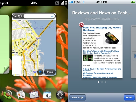
Home Screen
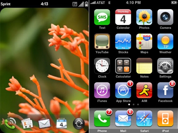
The iPhone’s home screen (right) is more of a traditional smartphone home screen, with icons for the various applications in a grid on the screen. The Pre’s, on the other hand, looks more like a miniature PC desktop. You can see your wallpaper, and there’s a Quick Launch bar along the bottom reminiscent of the Mac OS X Dock or the Windows taskbar.
But press the up-arrow button in the lower-right corner of the screen, and up pops an icon-style grid of your installed applications. Pre’s home screen is arguably more attractive, but the iPhone’s is a little more straightforward, since everything is right there to begin with; there’s no need to bring up the icon pane.
iTunes
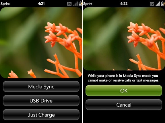
It’s true–the Pre can sync music with iTunes (including the newly-released iTunes 8.2) by mimicking an iPod when you plug it in (I’m sure Apple’s legal team will have a field day with that). And while it works reasonably well, it isn’t as seamless as using an iPhone.
When you plug the Pre into your computer, it’ll ask you if you want to use MediaSync and sync your iTunes music with your Pre, use the Pre as a glorified USB flash drive (which you can’t do with the iPhone), or just charge it.
While the Pre syncs just fine with DRM-free music files in your iTunes library, it can’t sync your contacts and calendars via iTunes. Syncing photos didn’t seem to work for me in my limited hands-on, though Palm says the Pre should sync photos and video. I didn’t have any DRM-free video files on my machine, so I couldn’t test whether it could indeed sync video over iTunes.
Gestures
The use of gestures by the Pre (left) takes some adjustment. For example, when you want to quit an application, you press the up-arrow button on the front of the unit to access the “card deck” interface. You can then switch between applications, or close apps you’re done using by paging through the cards and then sliding, or “flicking,” the one you want to close off the top of the screen with your finger.
While the iPhone has no screen to compare directly with this (the iPhone doesn’t support app multitasking), it does have a similar interface for managing open windows in Safari: You click on the button for a new window, then scroll horizontally to find your window. Where the Pre uses gestures, the iPhone uses a red “X” close button, as shown at above right, for getting rid of browser windows.
In this case, I find the iPhone to be a little more intuitive (or at least more obvious). Still, the “flick” gesture makes sense once you get used to it, and I’ve got to give points to Palm for trying something new.
Gestures, Part 2
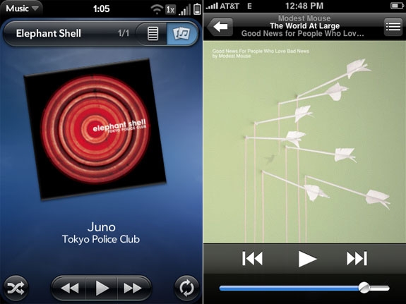
Navigating “back,” like going from the “Now Playing” pane in the music player to the “Album” pane for example, also differs between the two devices. The iPhone and many other smartphones use a button to go to a previous pane in an application. In the above example, the iPhone (the right-hand image) has a “back” button in the upper-left corner of its screen.
On the Pre, however, you make a “back” gesture by swiping right to left on the Pre’s gesture pad (the space immediately below the screen).
This threw me off, not only because I was expecting a button, but because it wasn’t immediately obvious in which direction I was supposed to swipe. On both the iPhone and the Pre, when you flip through photos, for example, you swipe from left to right to flip to the previous photo in an album, so I assumed the gesture-pad area would work the same way; instead, you must use the reverse direction.
Other gestures, such as scrolling and zooming in or out on images, are the same on both devices. Also, the Pre has a nifty, quick tutorial when you first use the phone to help you get acquainted with some of the gestures.
Keyboard
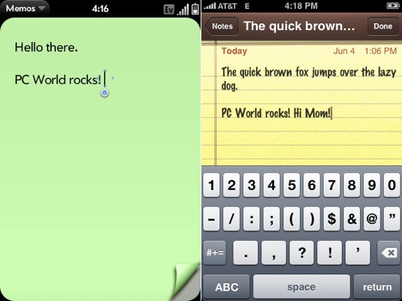
The iPhone (right) features an on-screen keyboard, while the Pre uses a physical keyboard. As our reviewer, Ginny Mies, notes, the Pre’s keyboard is a bit small and difficult to use. Neither is a perfect solution, and which you’ll prefer is strictly a matter of personal preference.
If you’ve owned an iPhone for a while, though, you’ve likely become comfortable using the on-screen keyboard; this keyboard is all the more usable because it flashes the letter in larger text when you depress a virtual key, a visual cue that helps you know as you go along how accurate your typing is.
I’m to the point where I can move more quickly on the iPhone’s keyboard than on a tactile phone keyboard, though I make more errors with it. I found the tiny, gelly keys of the Pre difficult to adjust to.
So Which Is Better?
Each phone’s operating system has a lot to like. Both are easy to use, and both are packed with clever features. My gut feeling gives the edge to the iPhone: It’s just a little easier to get the hang of. The Pre’s heavy reliance on gestures in some areas you might not expect (flicking apps off the screen to quit them, for example) could be a hindrance.
That said, webOS should have a bright future ahead of it, and I look forward to seeing it evolve and grow over time.
Source: PCworld.com
